product design
design thinking
corporate cards
expense management
Goals & Opportunities
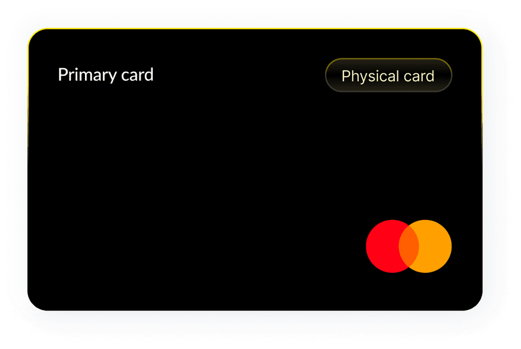
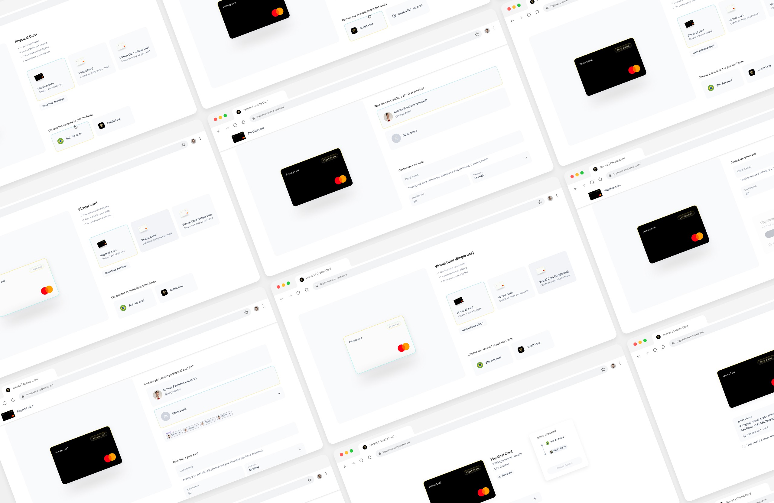
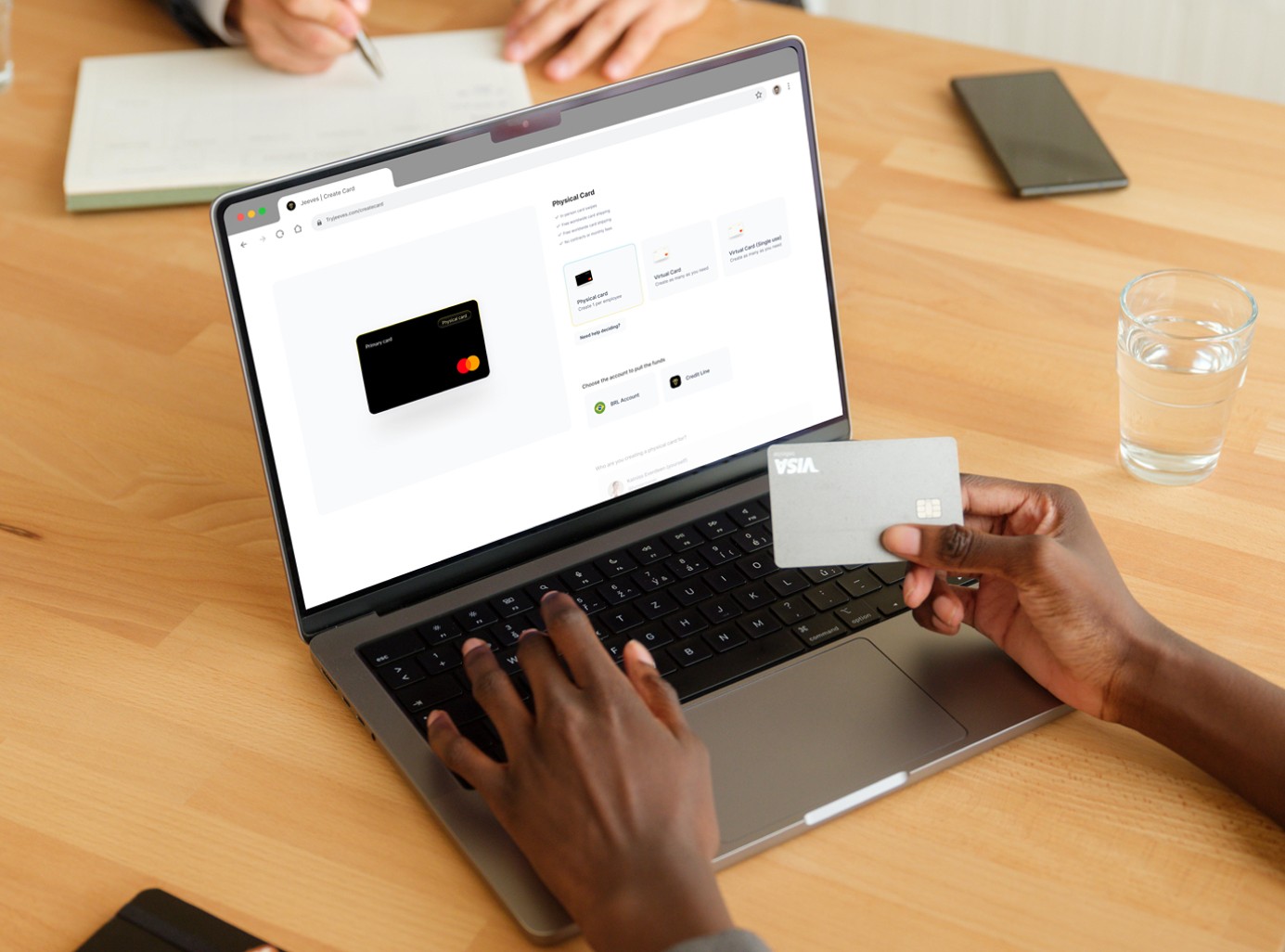
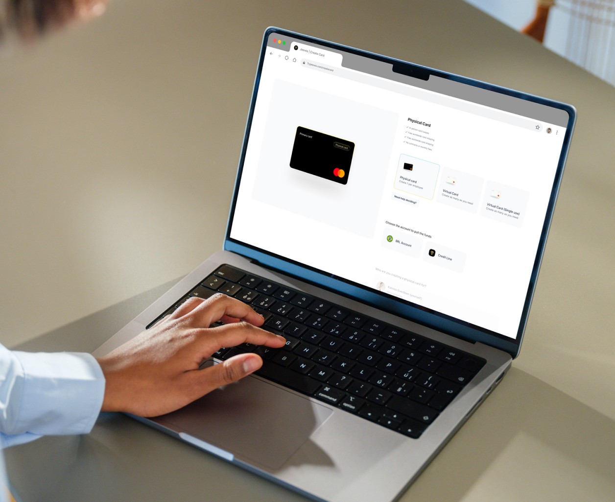
When rethinking this flow, I aimed to create a more fluid experience that wouldn’t make users feel like they were filling out one giant, boring form. This design needed to allow customers to navigate easily back and forth without having to retrace their steps. Using card illustrations was essential for helping users connect with the product.
Prototyping
To demonstrate how we could achieve this fluid experience, I created a prototype in Figma to visualize the scroll and enable user flow without requiring clicks on next or previous buttons for navigation.
Background
When launching the new Jeeves 2.0 platform, we faced tight timelines that limited our ability to make significant improvements to the experience. Due to the company's strategic shift, the overall experience felt rushed. This year, as I began to focus on giving the card feature the spotlight it deserved, I was determined to enhance the card creation flow and excite customers about what was to come.
Take a look at the before and after


