product design
product management
design thinking
corporate cards
expense management
Goals & Opportunities
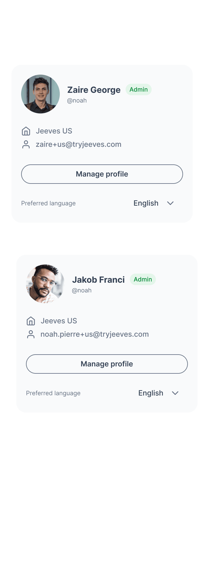
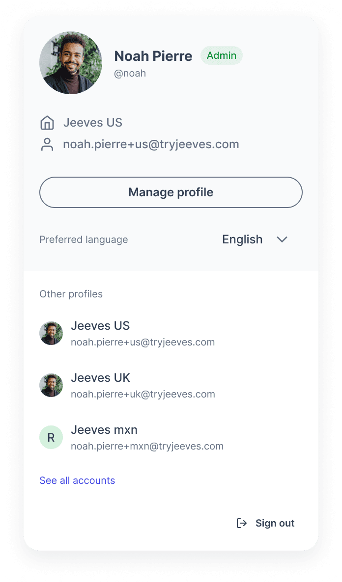
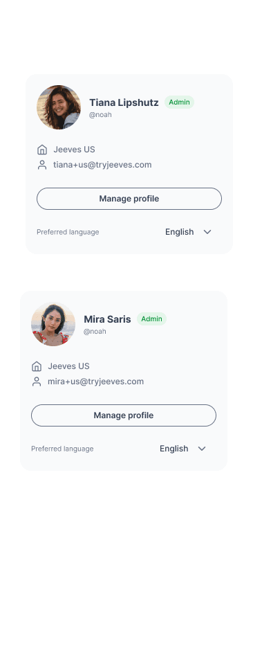
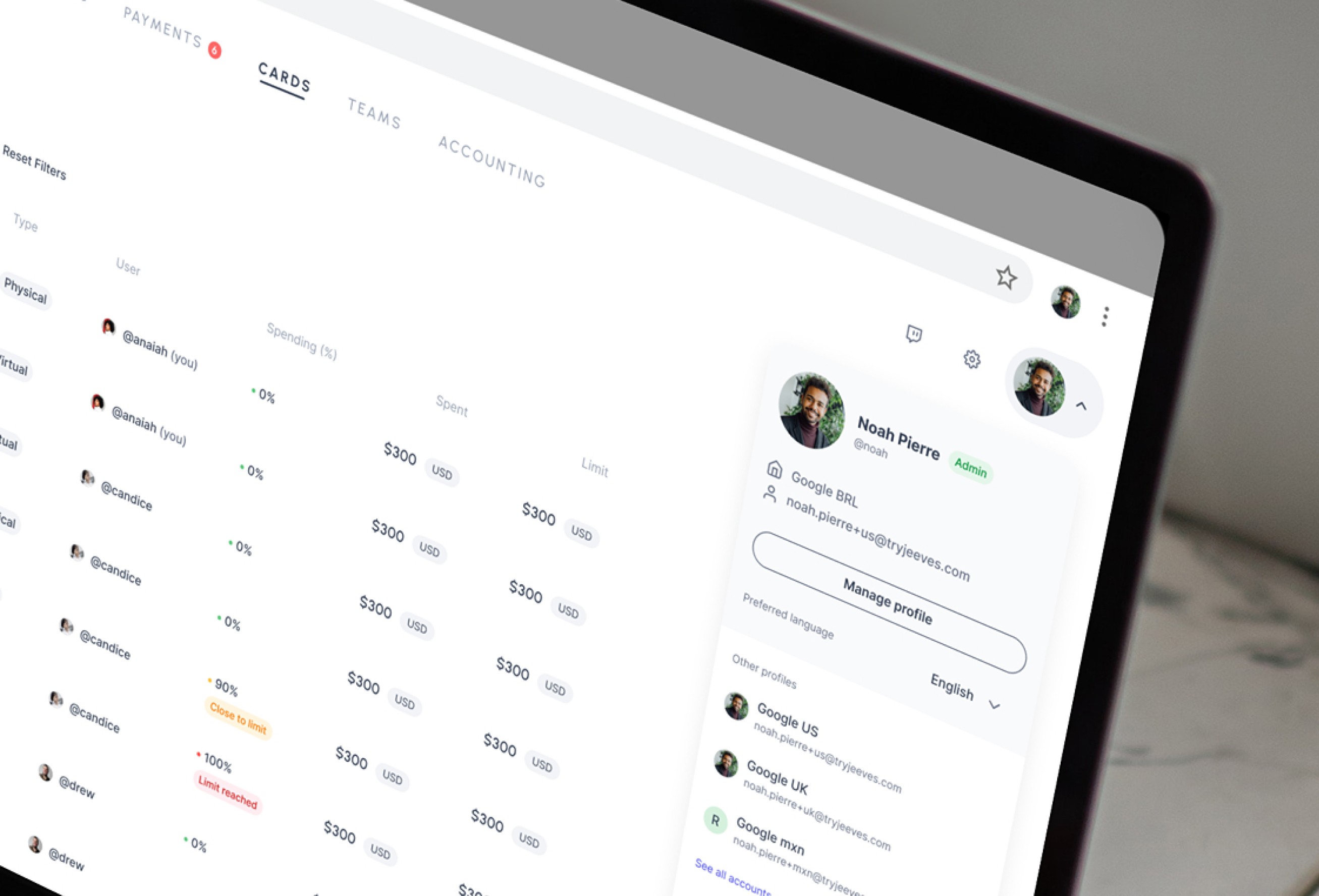
For this project, I needed to address several UX issues faced by customers with multiple accounts while incorporating their feedback. With this in mind, I aimed to design a modal that would help users easily understand which account they were logged into and provide a more efficient way to switch between accounts.
Prototyping
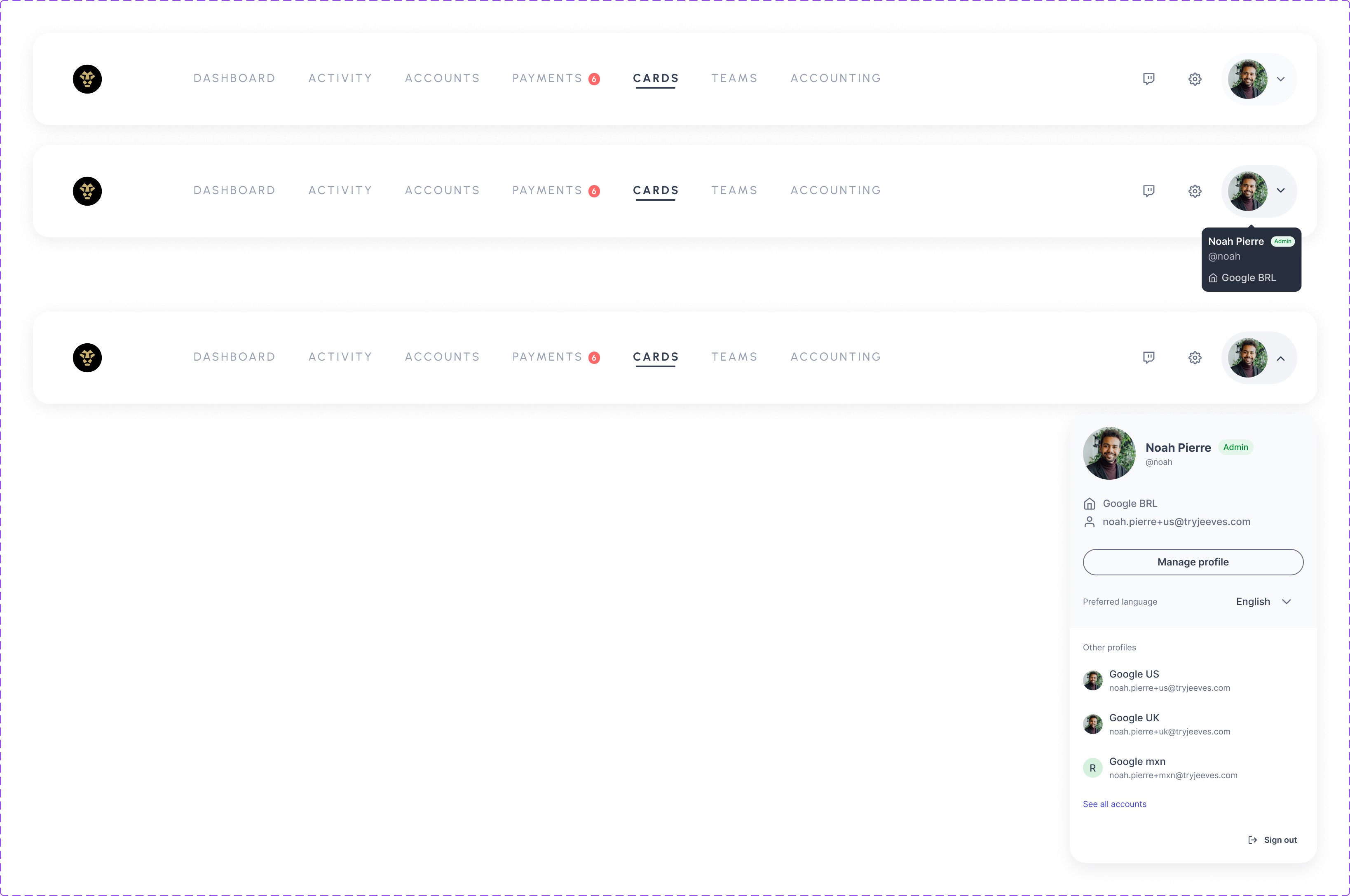
Prototyping this user modal was a crucial step in the design process for iterating the different statuses in the user dropdown. This dropdown features a hover effect when closed, enabling users to easily identify crucial information without needing to click. If users want to see more details, clicking on the dropdown reveals the user modal.
This component was developed as part of the design system, ensuring that all designers have access to the most up-to-date header menu across their projects.
Background
The old user experience only displayed the name and role in the dropdown, which occupied valuable space in the header. The biggest problem for customers with multiple accounts was the lack of any indication of which account they were logged into. Customers needed easy access to more information about their accounts without having to disrupt their workflow.
Take a look at the before and after
